
High-Speed Rail for New York State
I chose to take on the challenge of designing a brand for a hypothetical high-speed rail line connecting New Yor State. As a student in Rochester, the ability to take a quick trip to Buffalo or New York City would be an incredible convenience. The construction and operation of the line would also drive economic development in Upstate New York and strengthen connections within the state. I aimed to design a comprehensive and upscale experience to attract the travelling public.
Initial Concepts
I started by generating names and some liveries using a thematically-appropriate colors. Using an image of an existing train, I traced and colored these in Krita. I used elements of New York's culture to inspire the names and identities of the early concepts.
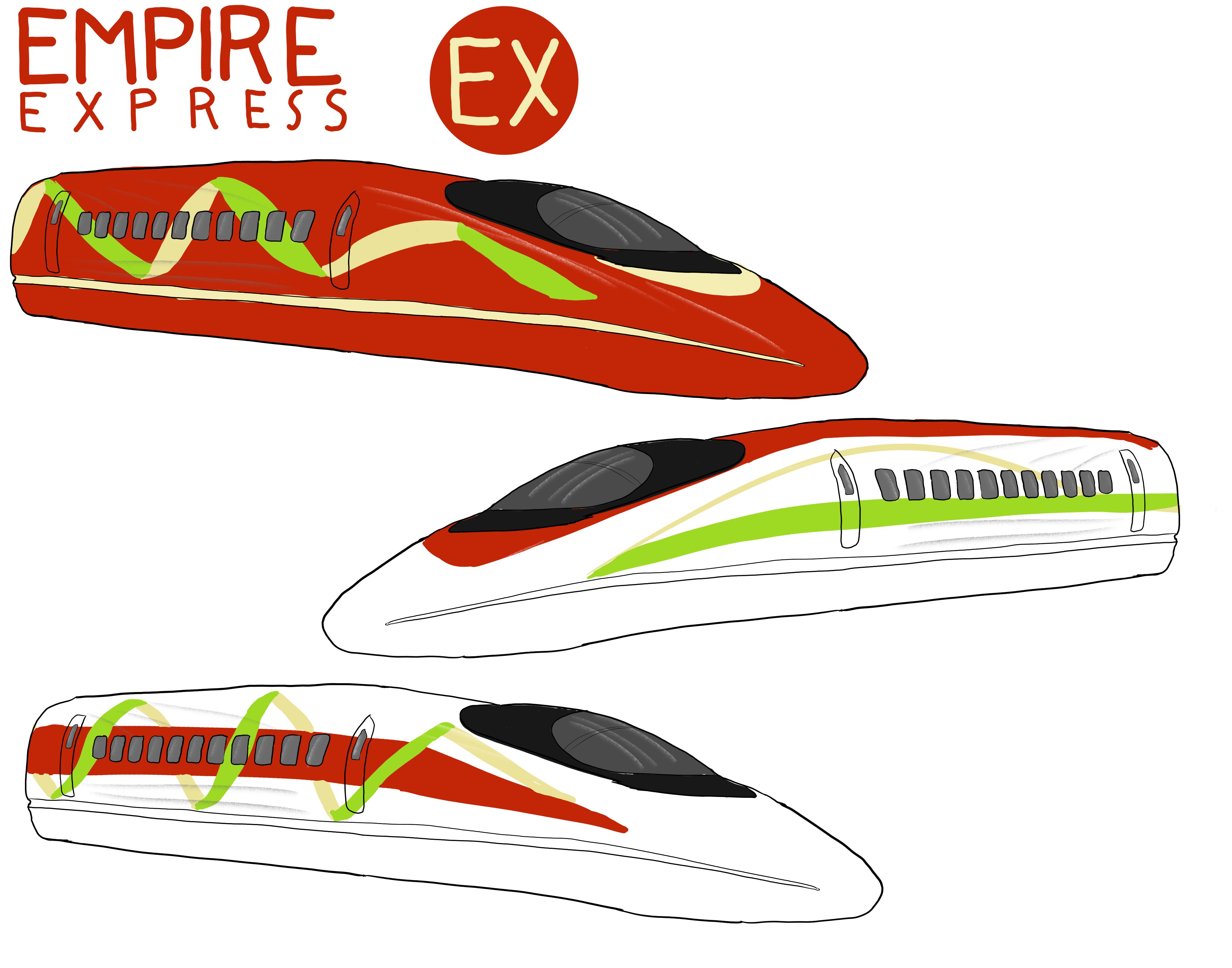
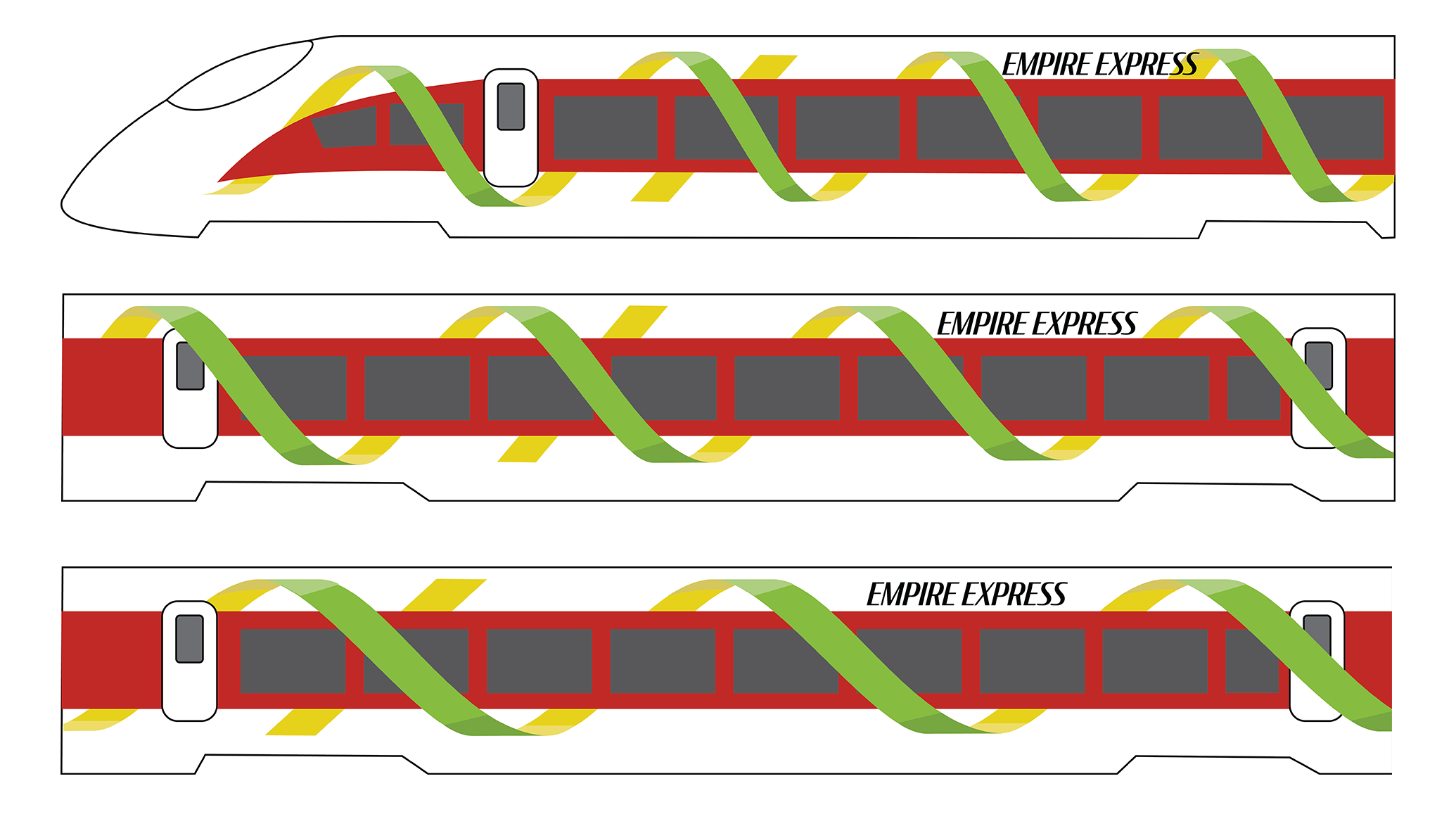
Empire Express
Inspired by the nickname "Empire State" and New York's renowned apple orchards, this idea had been in my head for a while. The colors are derived from apple varieties grown here, and the ribbon is meant to emulate an apple peel. This was the most popular concept with my friends and classmates, and therefore the one I chose to fully develop for this project.
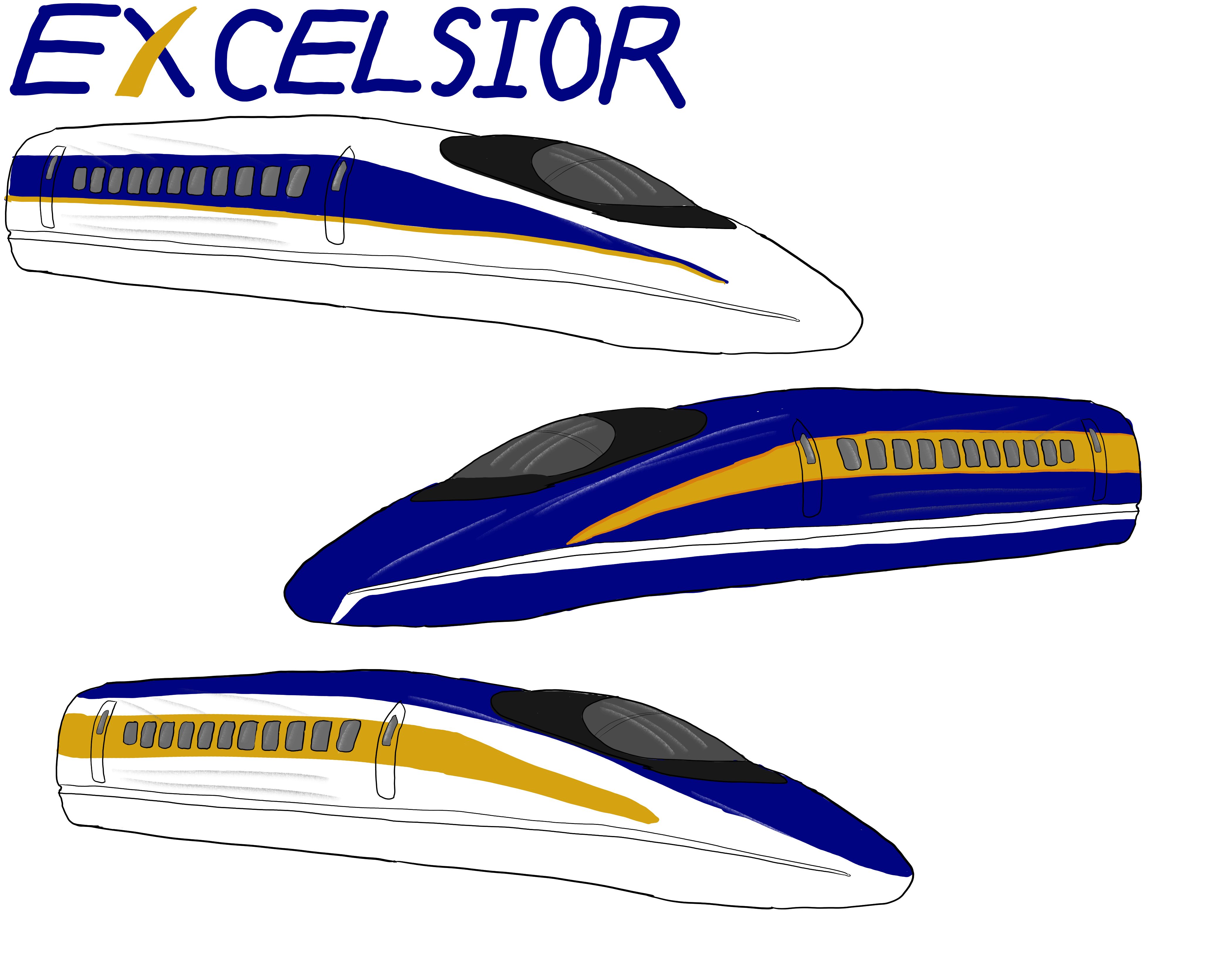
EXCELSIOR
New York's motto, translating to "Ever Upward," seemed like a promising direction. I used the state's official colors in a fairly traditional style to inspire confidence. The result was a businesslike identity that could easily fit an airline. However, this felt a bit too predictable, and I didn't have any good graphic elements to develop. Therfore, I dropped this from consideration.
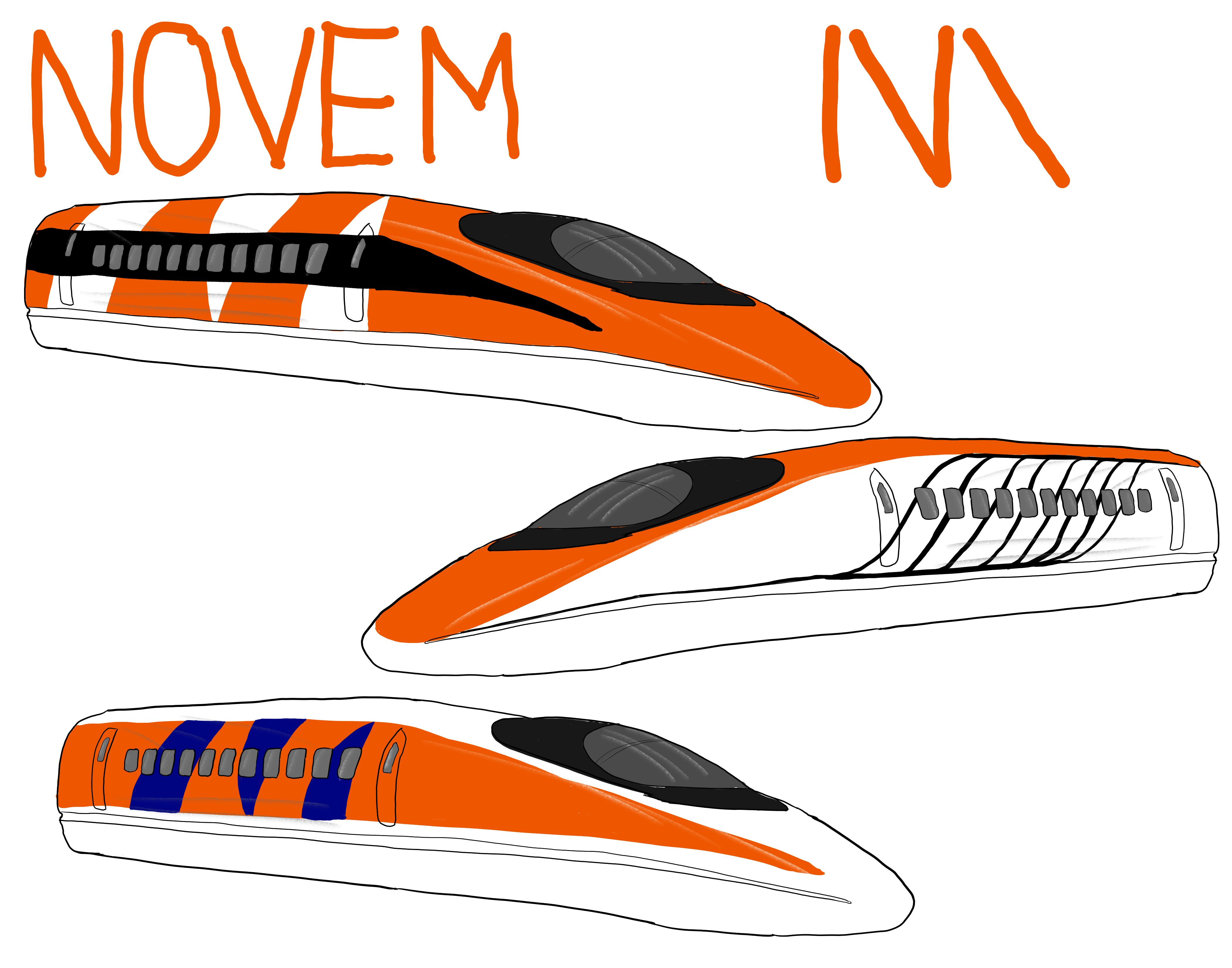
NOVEM
While browsing New York's symbols, I stumbled across the nine-spotted ladybug, Coccinella novemnotata. Abbreviating the name and picking a bold black and red palette made for an interesting and modern livery. This was my personal favorite, though it wasn't as popular with others. The lateral connection to the state was also an issue.
Assets
I generated a number of assets to fully explore the brand and to build the experience. I focused on the major touchpoints that passengers would interact with on their journey.
Livery
The peel motif continues the length of the train, varying in frequency: it decreases towards the center and increases at the ends. Dimensionality is added by wrapping graphics over windows using see-through mesh and light shading. It conveys a sense of motion even when still.

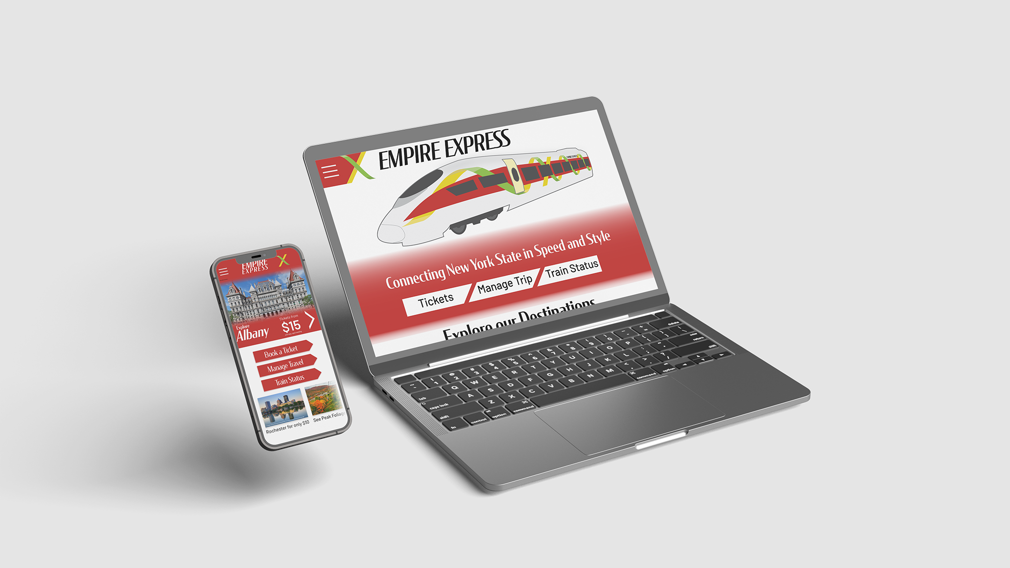
Customer Interaction
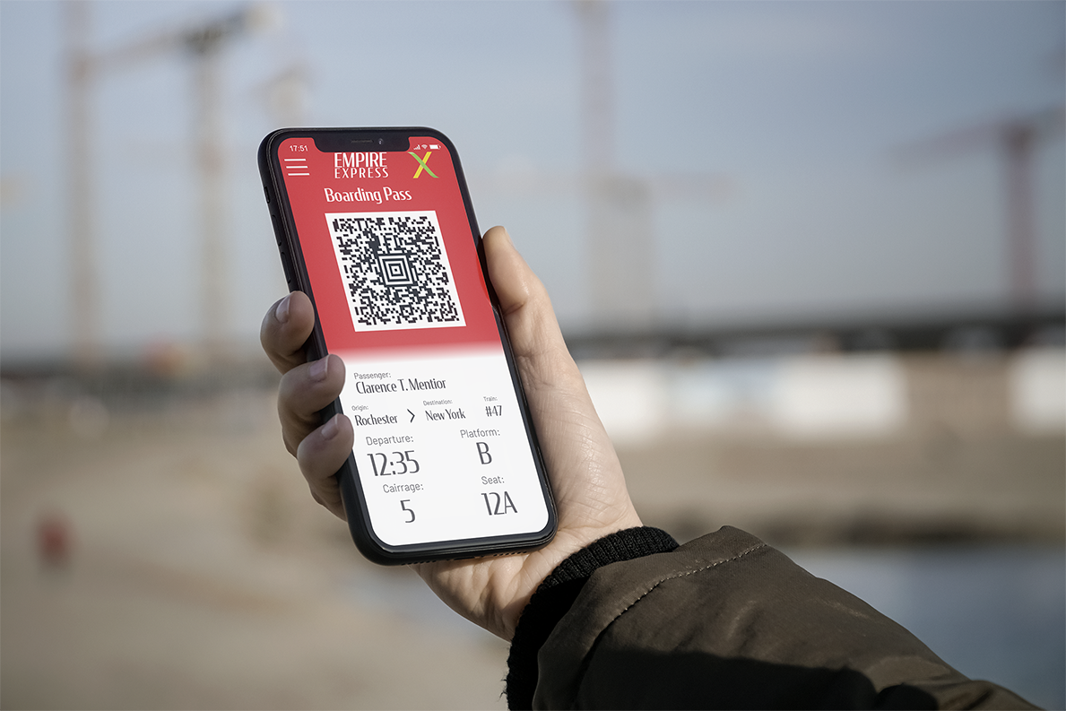
I designed an app and website, as required by any modern buisness. A loyalty program also felt right; the name "Garnet Club" came from the state gemstone.
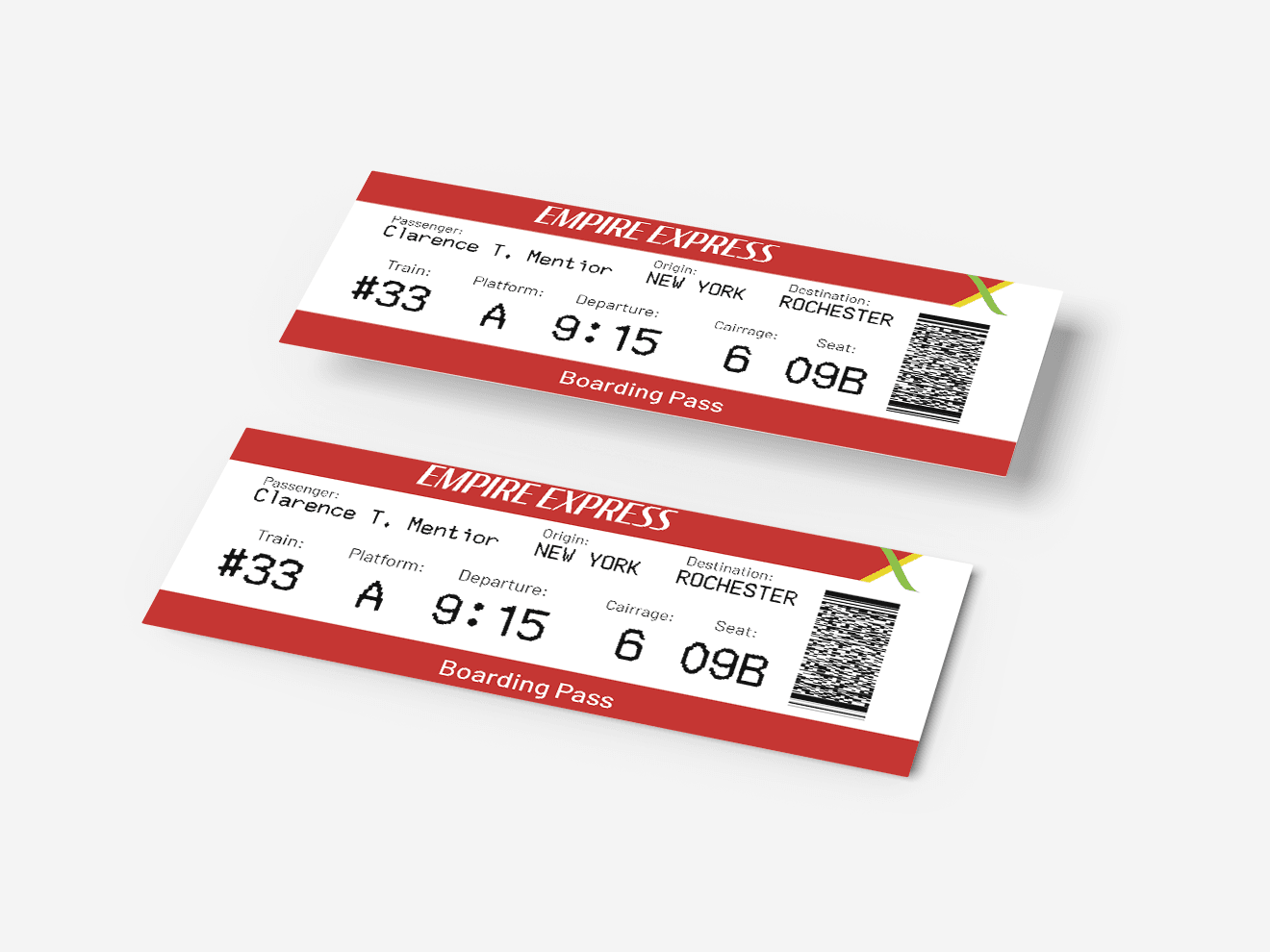
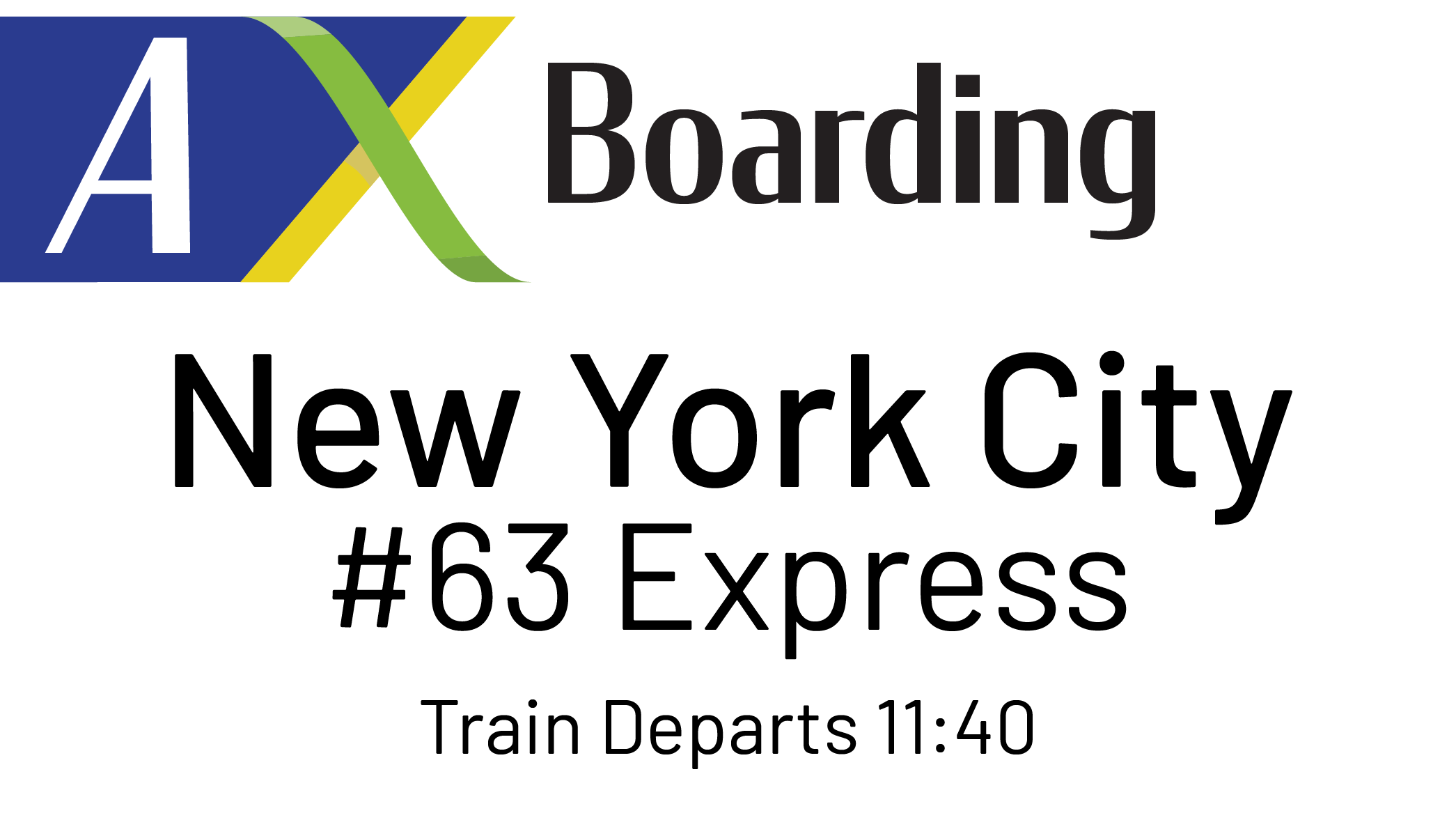
Ticketing
Boarding passes follow the same standard as airline boarding passes, allowing for the use of off-the-shelf hardware.
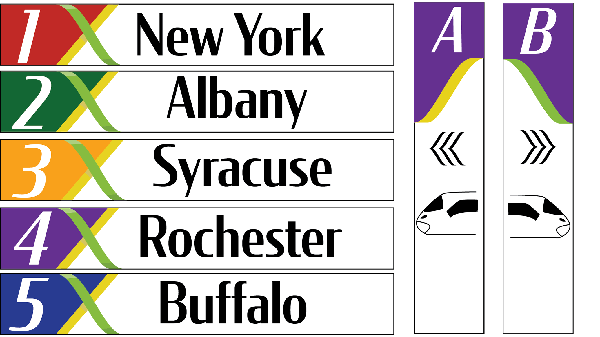
Signage
I designed some signage to be deployed in the stations. On the left are destination signs to be placed on the platforms, along with signs to direct passengers to specific platforms. Each station was numbered and given a color to match. These colors would be used as accents throughout the station, as on the platform signs. Finally, a digital signage board for the platform or station areas conveys information about arrivals, delays, and other announcements.